Design Portfolio

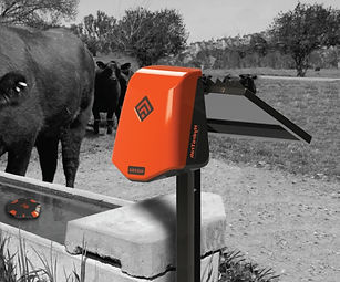
Creatista Plus
Nespresso and Breville partnered with the vision to produce a premium coffee machine that would be a commercial success through increased sales and profit.
The Creatista has an intuitive graphic interface that empowers users of all skill levels to effortlessly make barista quality coffee at home.
Overview
Nespresso recorded stagnating sales of capsule coffee machines and a rise of inactive Nespresso Club accounts in the United States, Canada, Australia and New Zealand. Using the Nespresso Club online platform, a quantitative survey was conducted to collect insights from club members who had not logged in over the past 3 months.


A lack of knowledge of the capsule coffee market led to kicking off the project with ethnographic research as I believed it was necessary to understand how users get their job done and what frustrates them in the process.
The Nespresso Club and Breville warranty database was used to access prospective users and a usability study on existing coffee machines, both capsule and espresso, were conducted to see where each machine failed or delivered on expectations.


A clear theme during the research was that the milk frothing results from a Nespresso machine was not perceived as being acceptable in terms of taste and texture. Further research in the struggling regions of the United States, Canada, New Zealand and Australia revealed the Nespresso highlighted a difference in coffee consumption compared to other regions. Therefore, the solution should be designed around a broader range of drinks including more popular milk-based recipes.


Insights from the discovery phase indicated a few key areas to help improve the coffee result and where interaction with the coffee machine could help improve user experience.
For a truly great coffee making experience we needed to consider our users’ needs relating to:
-
Control of the coffee outcome to suit individuals
-
Convenient and easy to use
-
Minimal cleaning required
These insights began pointing to a better design of the UI structure and contextual content strategy.

A lot of time was invested in task analysis, user flows and language before starting any design and stakeholders were included early to ensure there was clear communication and agreement on our vision. Hand sketches were used in the early stages of design to rapidly explore alternatives without spending time digitally drafting more refined concepts.

Exploration of the hierarchy of content was thoroughly explored to ensure appropriate and sufficient information is shown to the user without becoming overwhelming. During the earlier stages of development detail design was not as import and placeholder icons were used.

We validated hardware by testing static screen patterns and assessed the readability, colour and style of our proposed components. Using Proto.io and a 3D printed coffee machine housing we put an interactive prototype in front of both primary and secondary user groups and iterated the design based on the insights gathered during the usability sessions. We embraced these constraints from the beginning of the project and used them to help us create a simpler and more accessible solution.

The digital UI was the first of its kind for both Nespresso and Breville and so it was important to create a guide that will ensure a common visual language within a product and between future products. Breville’s first digital brand guidelines for consistent design over all future digital products included colour palettes, iconography, typography hierarchy and product specific copywriting.


Once some solid progress had been made with sketches and low fidelity mock-up, the designs were made into more defined digital mock-ups and presented to key stakeholders for approval. We then created UI specifications to communicate the design intent and collaborated with software engineers in Hong Kong to make our vision a reality. After 3-months of back and forth, language barriers and hard work from all involved we had a software version ready to be loaded onto a working coffee machine.


After 3-months of back and forth, language barriers and hard work from all involved we had a software version ready to be loaded onto a working coffee machine. Once off-tool prototype coffee machines were available from the Chinese supplier we conducted a global field trial and sent prototypes to Switzerland and the United States. We also conducted our own usability testing in Australia.

The final solution promised to address three key areas identified during our research: easy cleaning, more choice and convenience to users.
With the added feature of a milk frothing steam wand the coffee machine requires regular maintenance to ensure it does not reduce the quality of coffee being produced. Clear and informative cleaning instructions were created to guide the user through simple tasks to ensure proper functioning of the machine.

The machine offers a range of drinks and includes recipes for an additional four milk-based drinks commonly sold in the target markets.

Pressing START automatically begins the coffee extraction for a selected coffee using the preset settings. Once completed, the screen prompts the user to START the milk cycle.
Users have the flexibility to adjust the coffee volume, milk temperature and milk foam to suit their individual taste.
Simply press the SELECT dial to begin the adjustments and they will be saved for next time.

The design was internationally recognised and received the Red Dot, Good Design, Chicago and IDSA awards in the year of release. User reviews were overwhelmingly positive, averaging 4.8 stars, with many mentioning the ease of use as a standout feature.

More projects